My exhibition deadline approaching, I really needed to start thinking about what paper I’d want my final images printing on. Therefore, I did a big paper test at the University of Huddersfield digital print centre, testing on ivory watercolour paper, silk coated card, munken rough and munken smooth paper. I found that the ivory watercolour paper was my favourite. However, the weight was not heavy enough for portfolio prints where many people will be handling them. The silk coated card was the correct weight and feel however, it made the colours on my photographs too saturated. The munken rough and munken smooth papers felt great to touch however they gave a grainy texture to the photograph and were not complementing my sharp images.
Not happy with any of these paper types, I ordered some samples of G.H. Smith. For FREE!!!
I ordered accent smooth in glacier white and natural to see if the colour of the paper would change the impact of my photographs. When the paper came, it had a sticker on therefore I had to do a test print first to make certain I would not print my photographs on the sticker and get an unfair test. This was a bit of a faff but the paper was free so I can’t really complain. I found that the natural paper really complemented the colours of my photographs but the glacier white was over powering.
I then tested full gloss and semi-gloss papers on the large format printer, and this gave a much better result. The paper weight was perfect for potential clients to be handling; the colours were much more appropriate and there was no grain to the images. The full gloss paper was too shiny and reflected the lights onto the image, taking away detail, therefore, the semi-gloss suited my images much better- I had found my chosen paper!
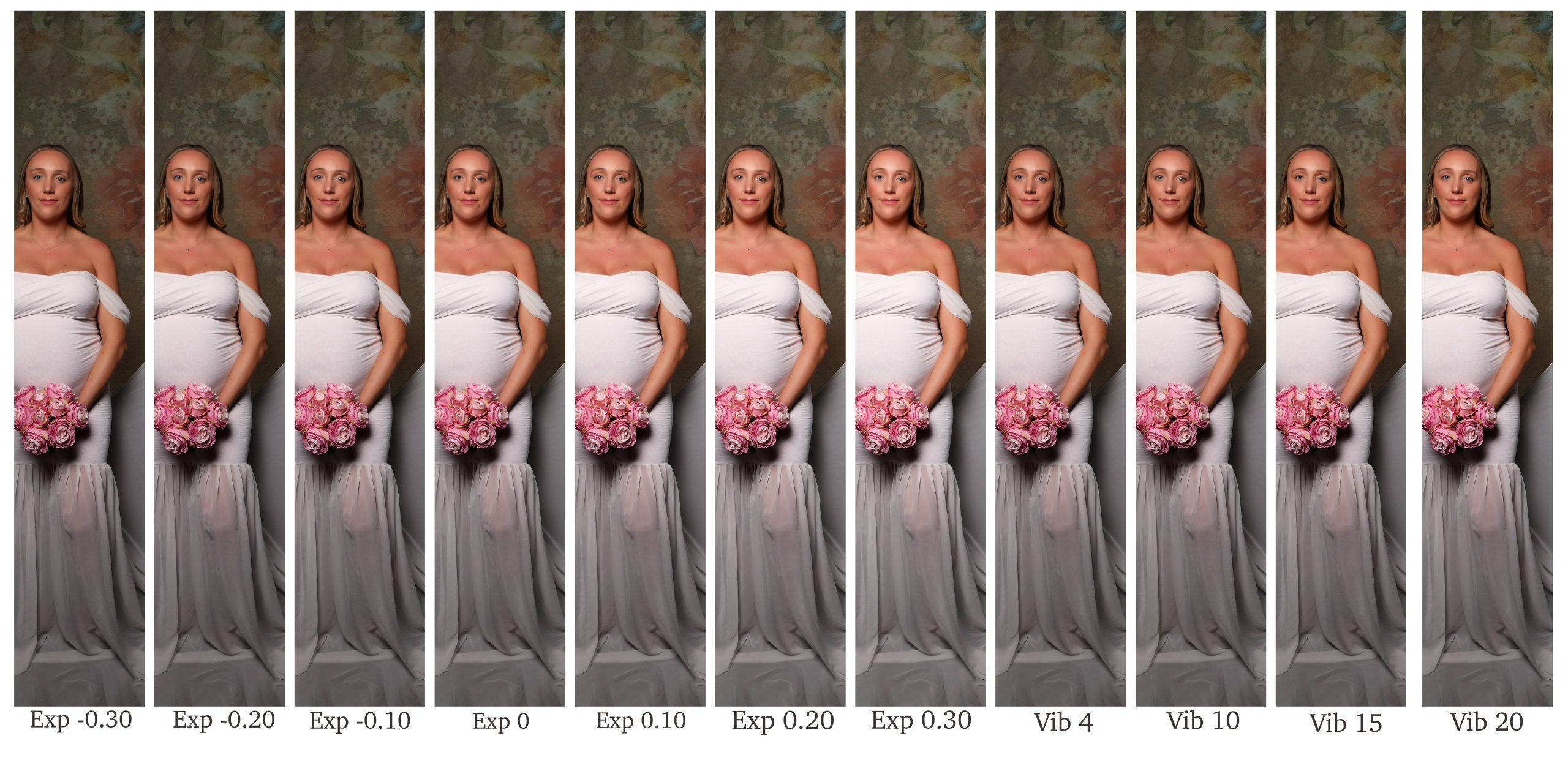
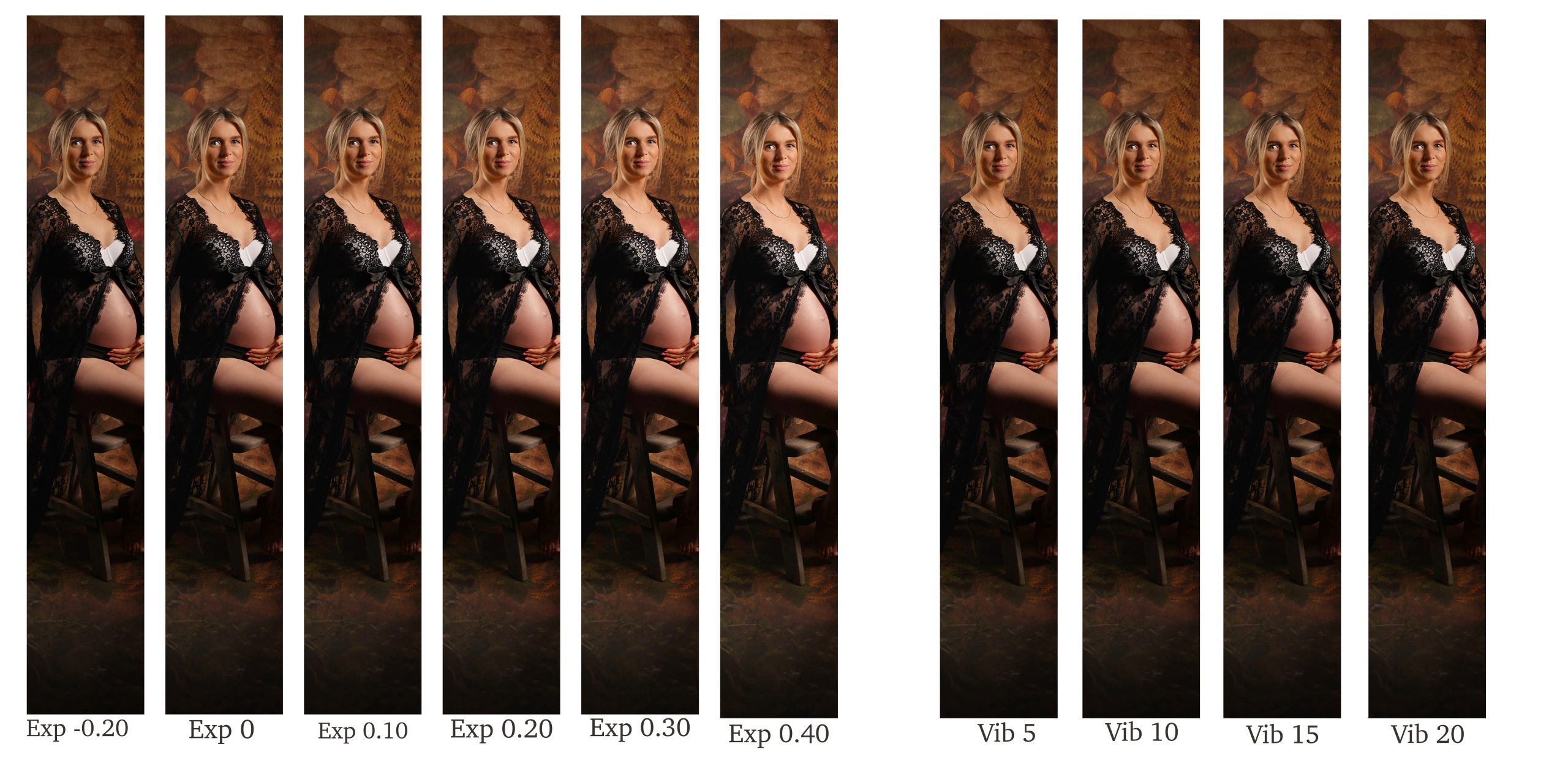
Now, knowing what paper I was printing everything on, I was able to experiment with the exposure and vibrancy of the photographs as I found when paper testing these were the main aspects I needed to change.
To do this I cropped a section out of a photograph, making sure it had skin tones and shadows, allowing different aspects of the image to be tested. I then opened the image into lightroom and changed the exposure in stages, saving each stage separately ready to be put into a document next to each other. I varied the exposure from -0.30 to 0.30 allowing a wide difference in brightness. I did the same for the vibrancy of the image which varied from 5- 20. I did this for four of my images which varied in colours and in the amount of shadows in the photograph.
Looking at how this had printed on semi-gloss paper, I found there was a pattern to the best way of exposing my image to around 0.20 and changing the vibrancy to 5 but also changing the saturation to 2. I was then able to print a set of photographs I was happy with and to change any that I thought needed it. I’d highly recommend this process to anyone wanting to use their photographs as prints. Although it is a long and time consuming process, it is worth the perfect image in the end.